Brand identity · Software company
Redbee Software
- Role
- Brand Designer
01 Overview
Recrafting a visual identity.
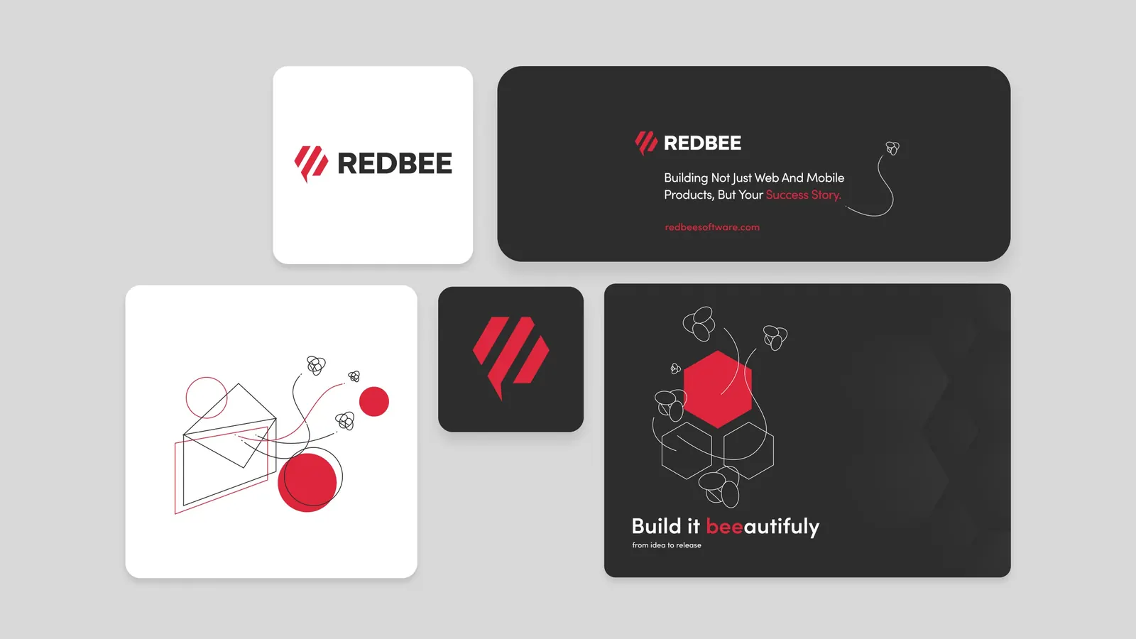
The Redbee visual identity was created to refresh the old identity. We built everything around “red bee” and “hive”.
Main challenges
- Reinterpreting the old concept
- Creating a simple and memorable logo
- Selecting the “red” and all neutral colors, and finding a good typographic style
- Extending the visual elements and patterns to all materials
- Creating a brand manual
- Creating and revamping the old website
- Building their interactive portfolio
- Preparing everything for print
Tools
- Adobe Illustrator
- Adobe Photoshop
- Figma
02 Logo
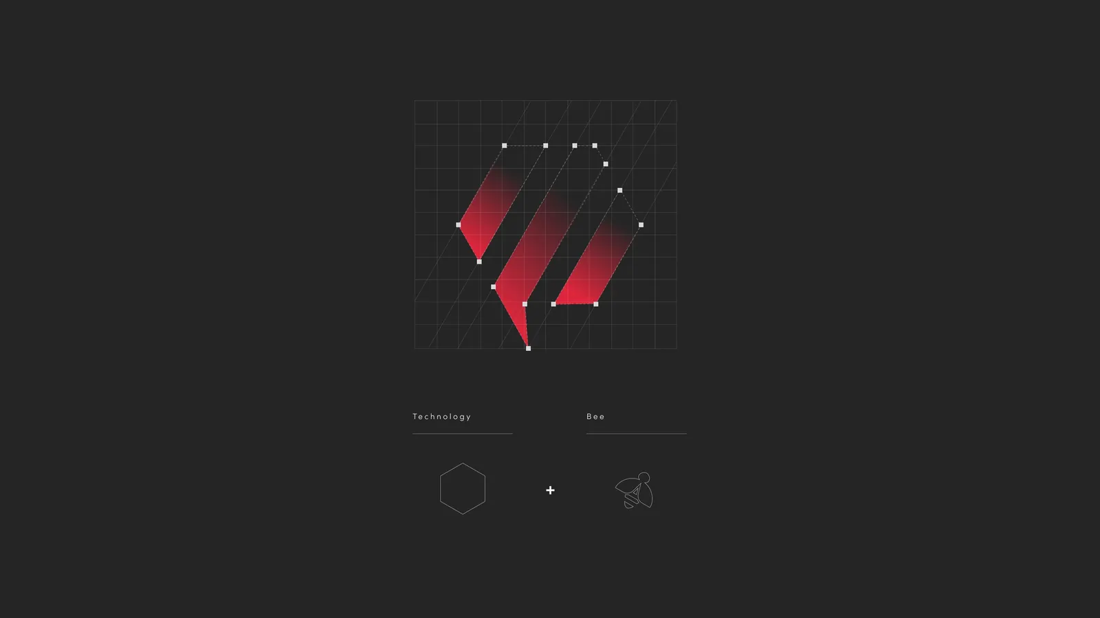
Technology + bee.
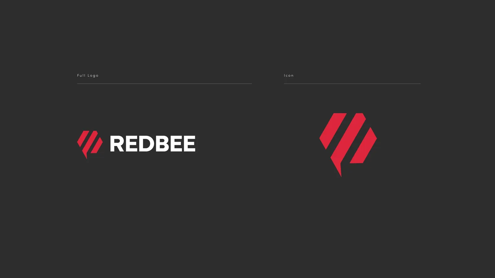
The mark joins two ideas: the hexagon of technology and the hive, and the bee.
03 Typography & color
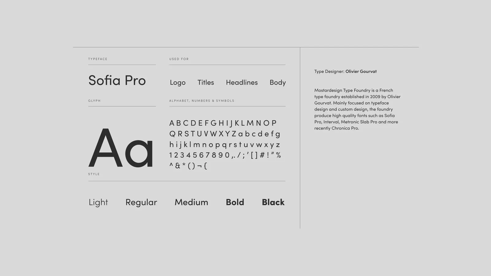
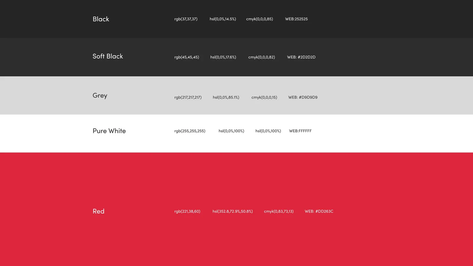
One typeface, one red, four neutrals.
Sofia Pro is used for the logo, titles, headlines and body text.
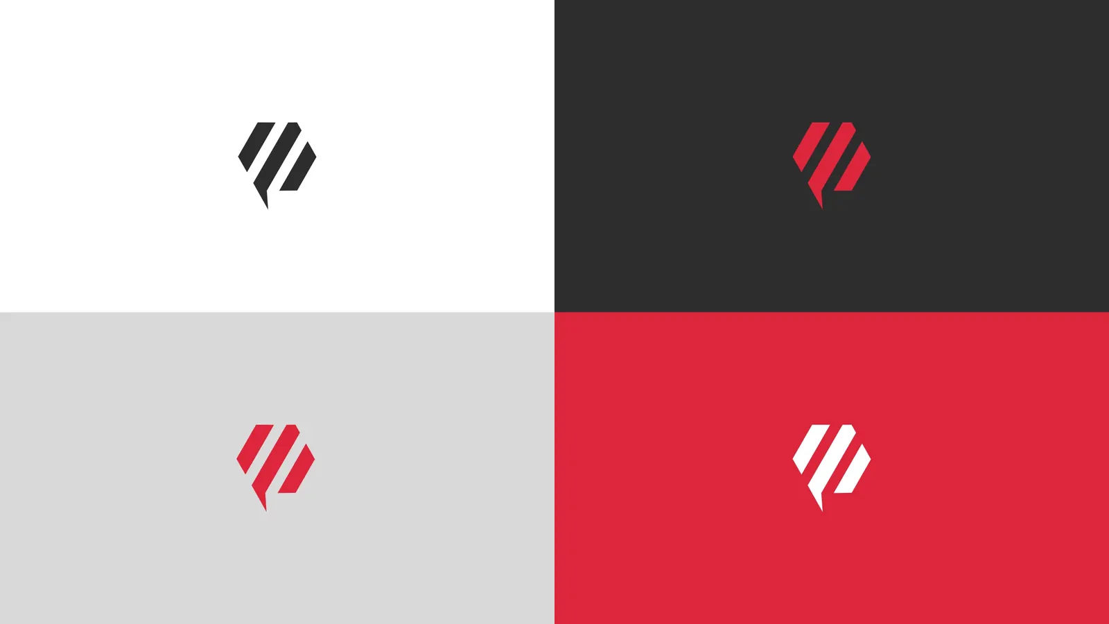
The palette is Red with Black, Soft Black, Grey and Pure White.
04 Brand manual
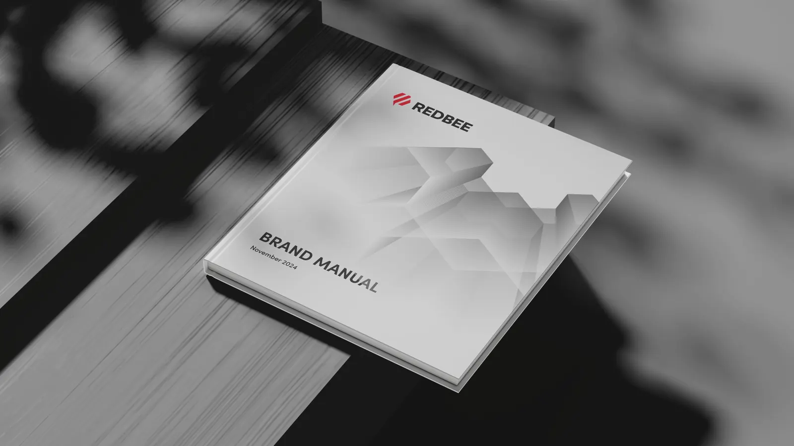
The rules, written down.
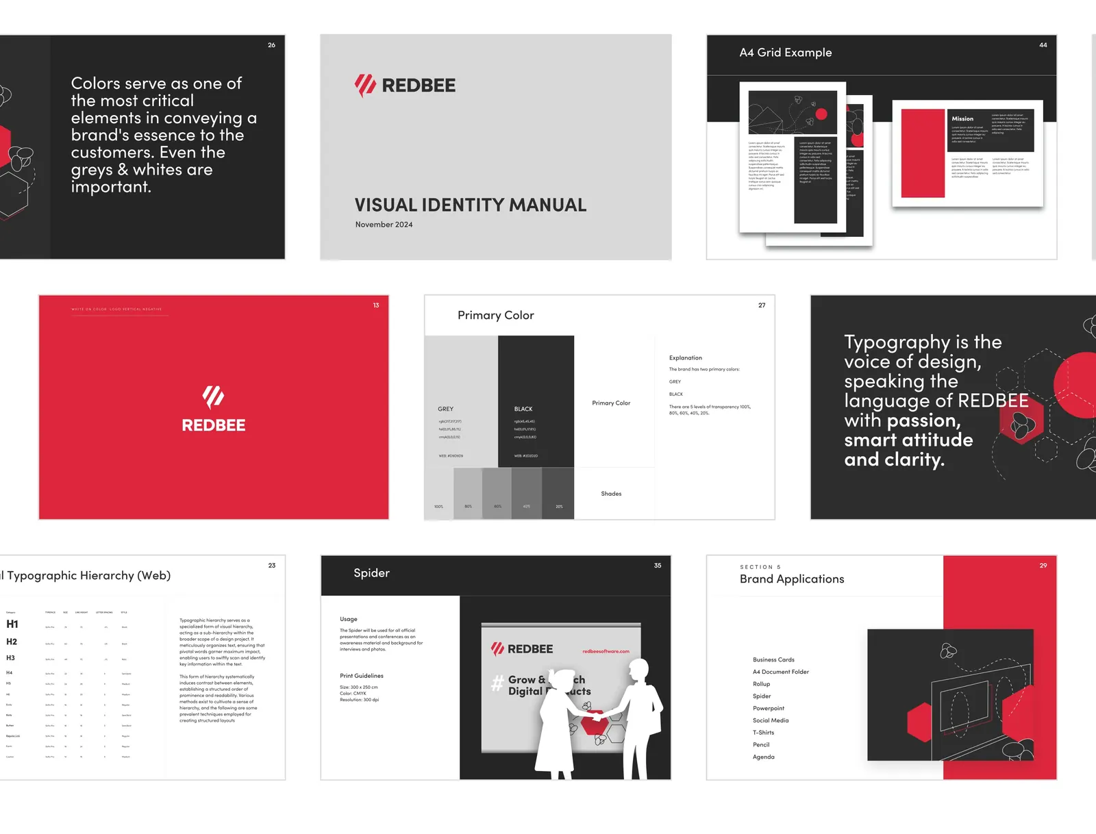
The visual identity manual (November 2024) documents the logo versions, colors, typographic hierarchy, grids and brand applications.
05 Brand in use
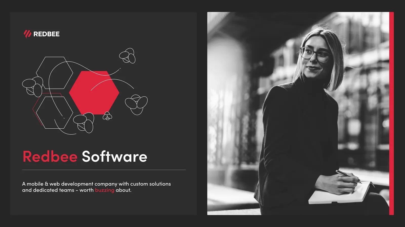
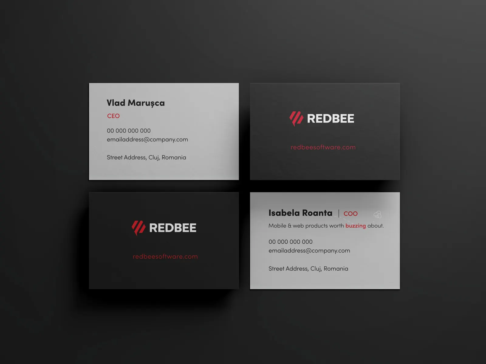
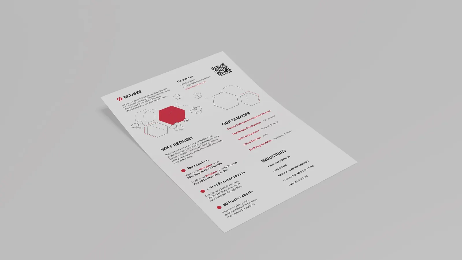
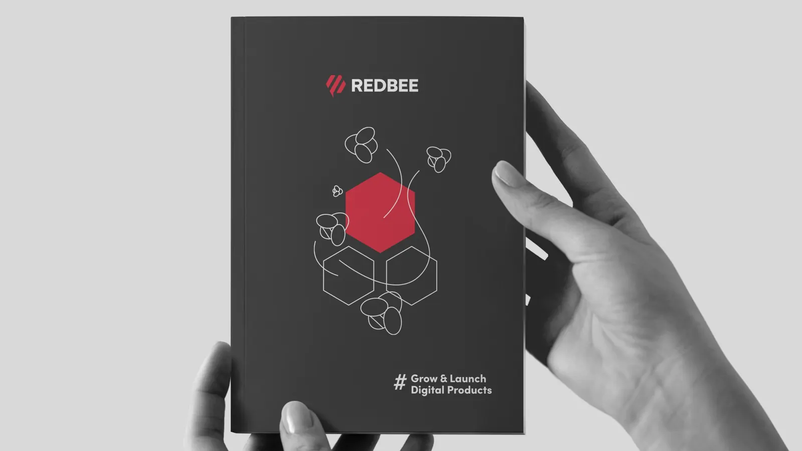
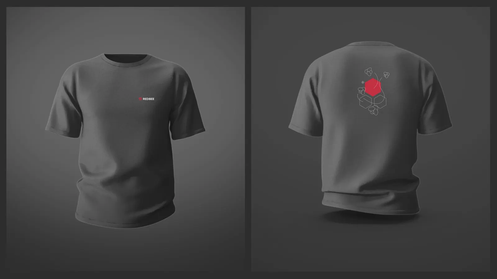
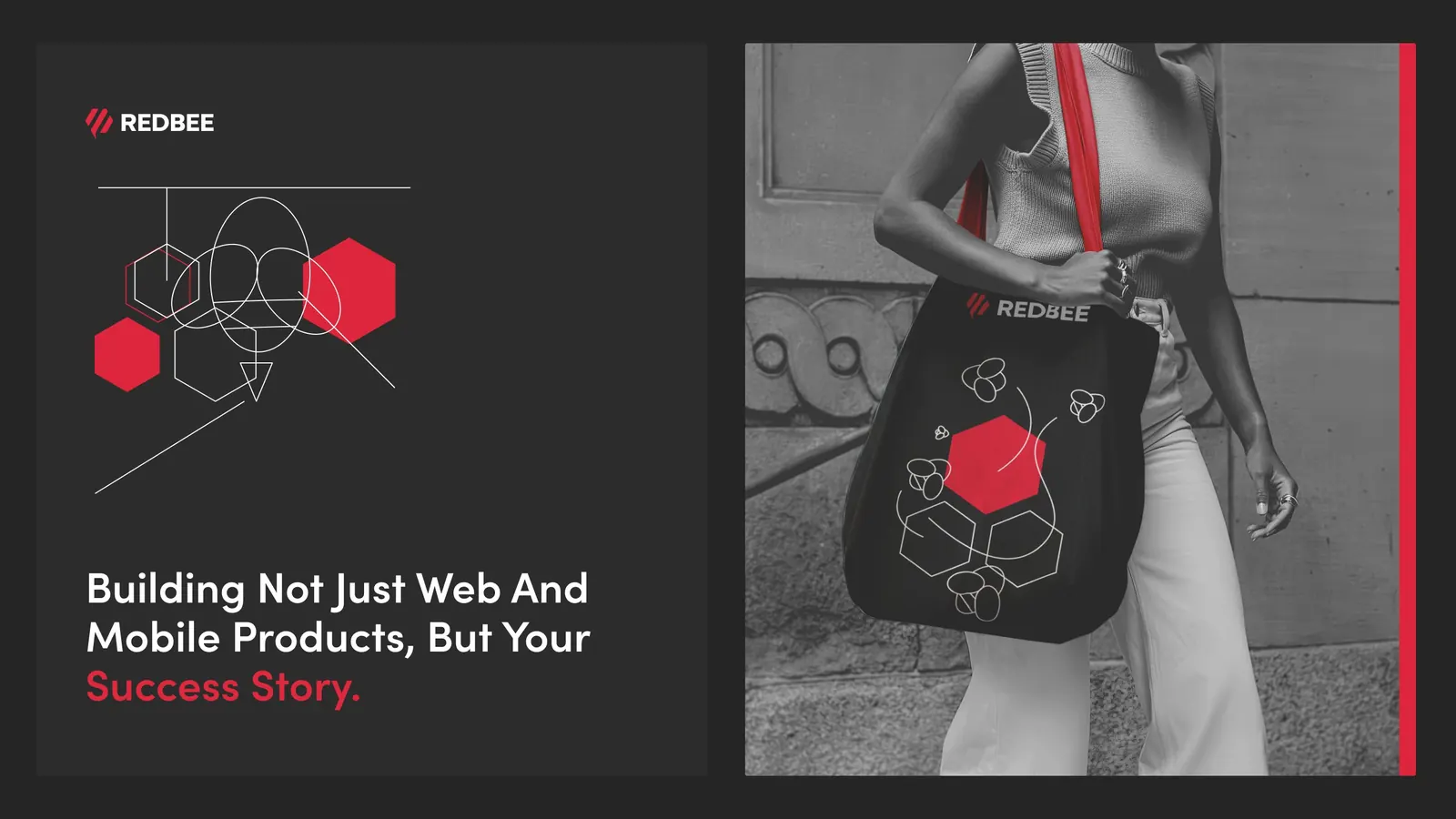
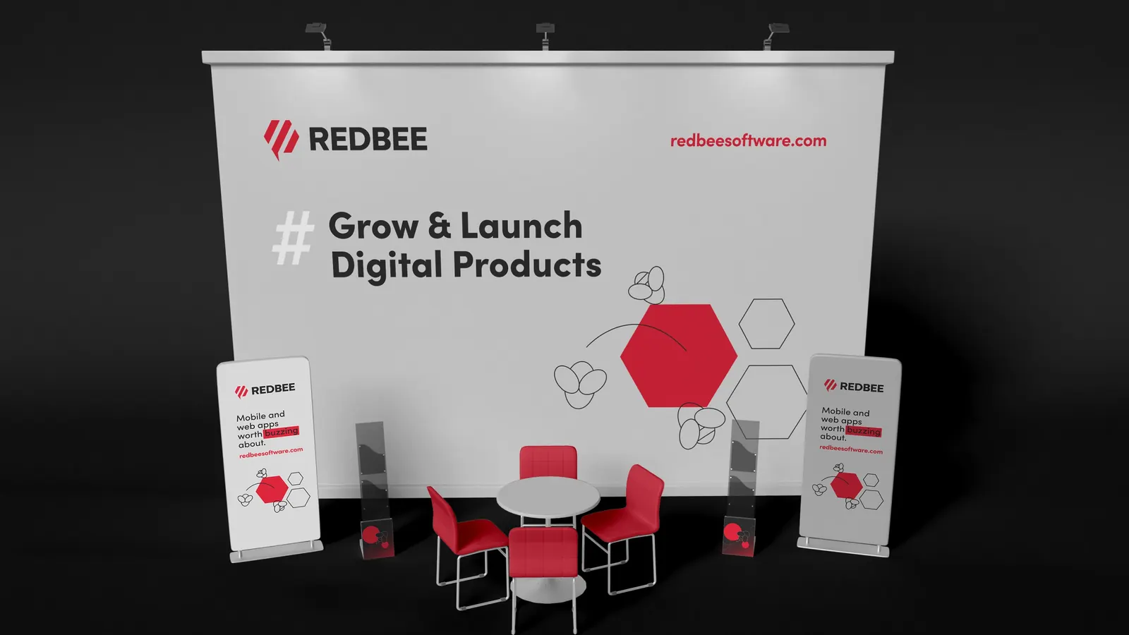
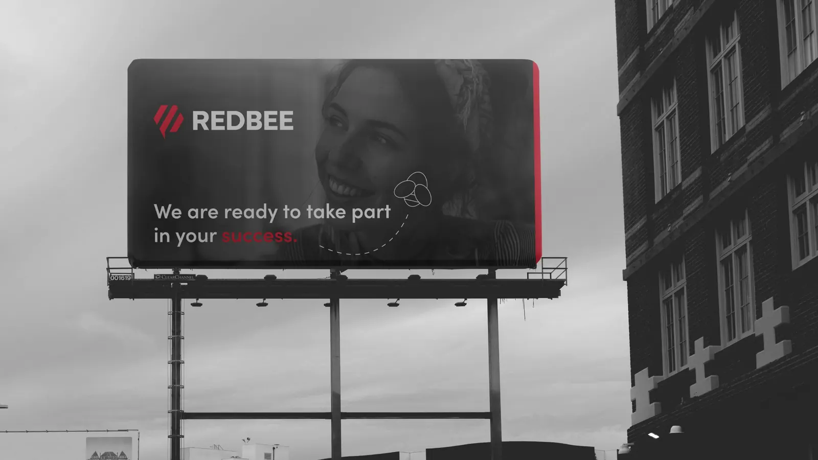
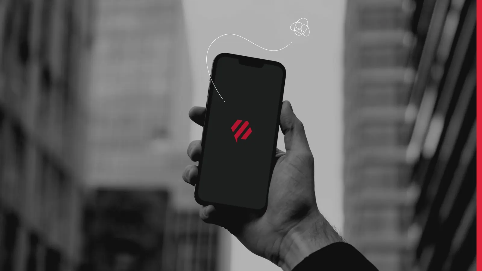
Visual elements and patterns, extended to all materials.
06 Website
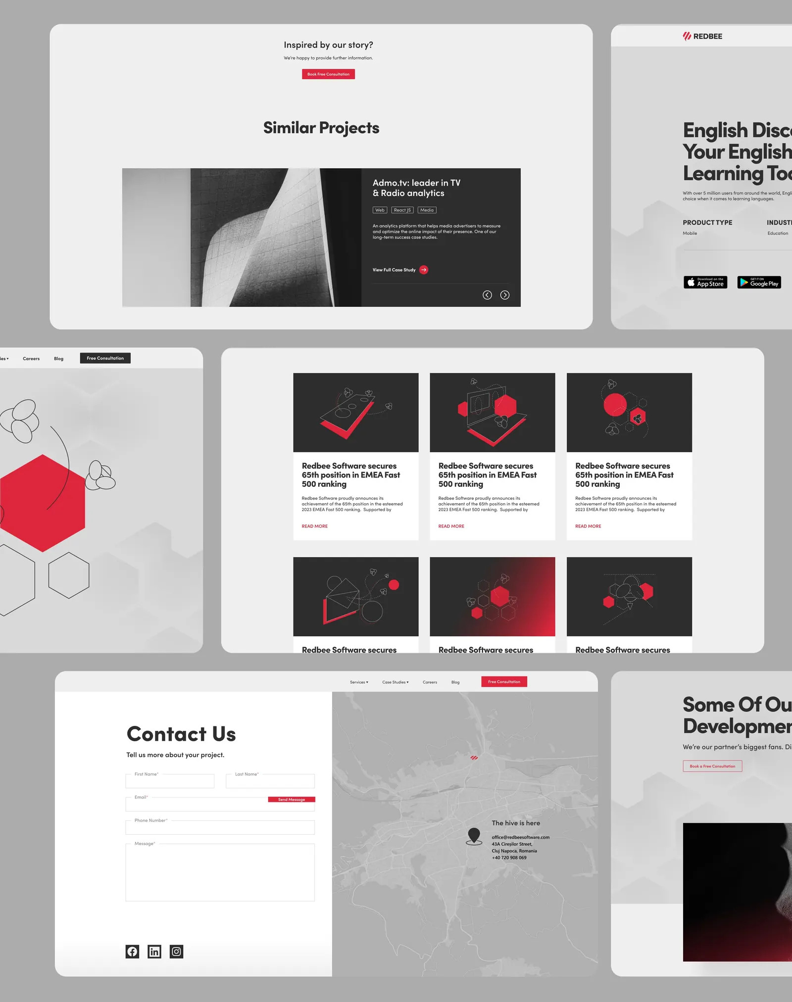
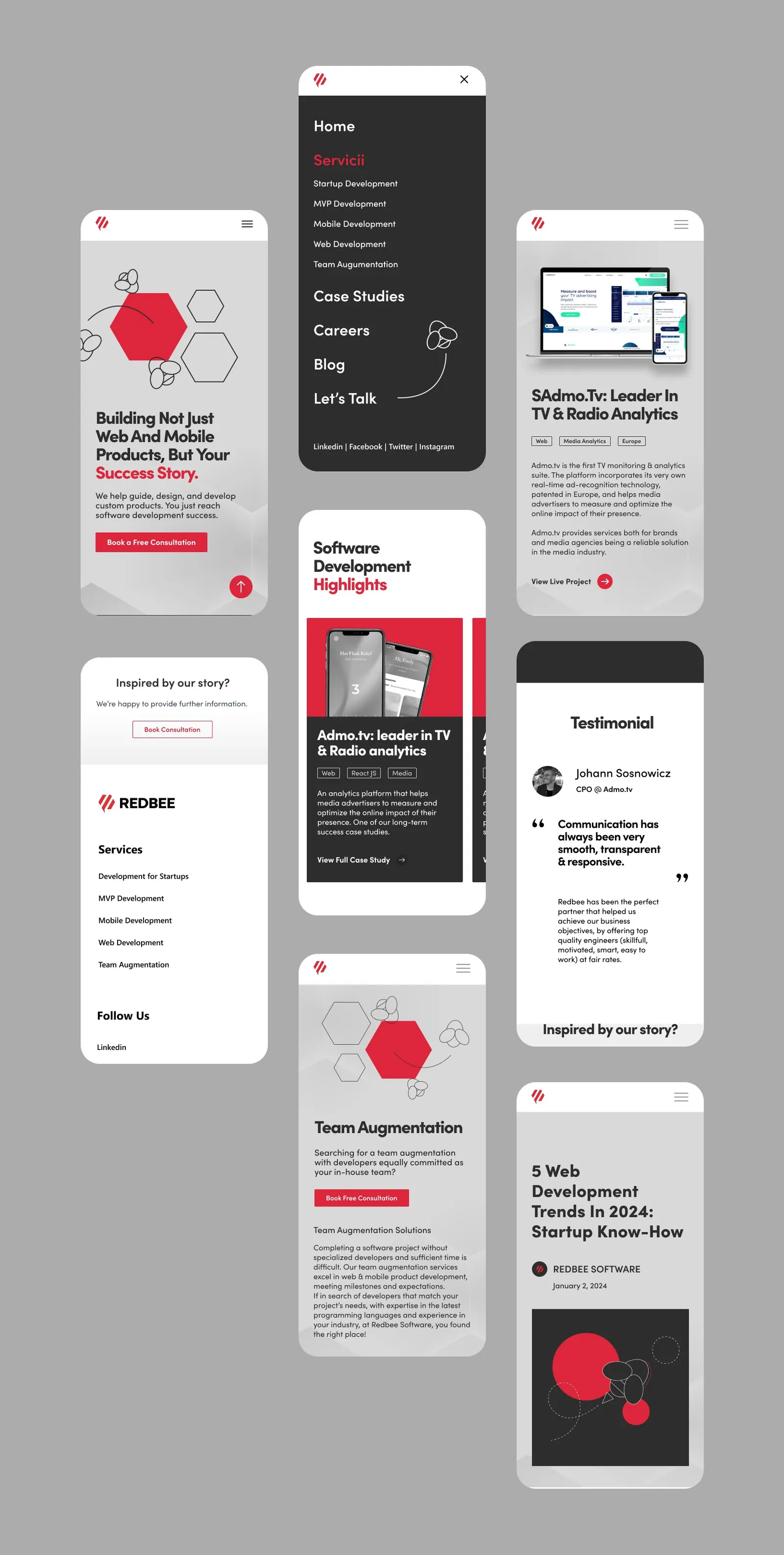
A revamped website and an interactive portfolio.

Next project
Robotics Valley — Innovation hub brand identity
Let’s work together
Let’s start your project.
Send a brief in five taps or contact me directly.