SaaS · Post-purchase platform
WeSupply
- Role
- Product Designer
- Years
- 2021 – 2025
- Where
- Romania – USA
01 Overview
A post-purchase experience platform for eCommerce.
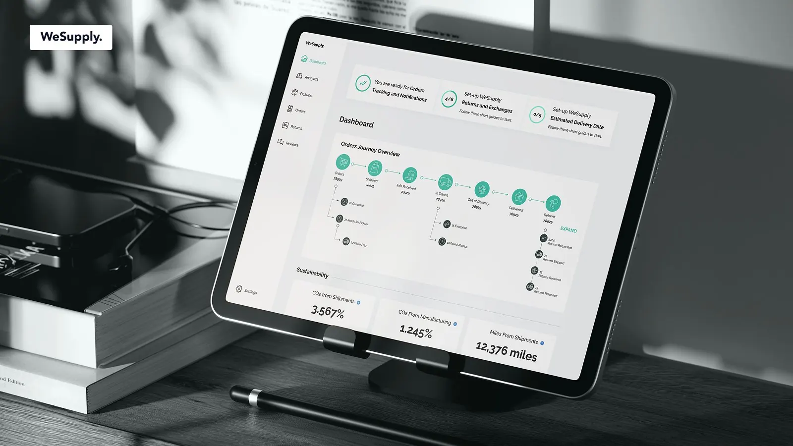
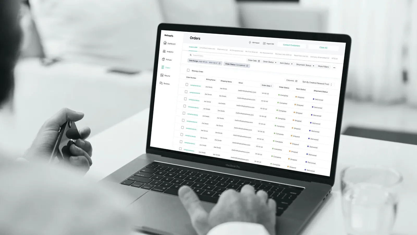
WeSupply is a post-purchase experience platform for eCommerce businesses, helping them manage and optimize shipping and returns.
It centralizes order tracking, provides self-service returns, offers estimated delivery dates, and sends proactive delivery notifications.
WeSupply enhances customer satisfaction, reduces support costs, and drives sales through data-driven insights and order management.
- Order Tracking & Notifications
- Returns
- Estimated Delivery Date
02 Project purpose
Six goals, from the first audit to new sub-products.
- 01
Evaluation
Create an audit (before and after) to see progress and success rate.
- 02
Update existing UI/UX
Create a new UI and UX to improve the old interface (mental model).
- 03
Onboarding process
Upgrade the onboarding process.
- 04
Layout
Create a clean layout design.
- 05
Build the product
Build the product and create a design system for handoff.
- 06
Extending
Extend the UI/UX to other sub-products.
03 Heuristic evaluation · 2021
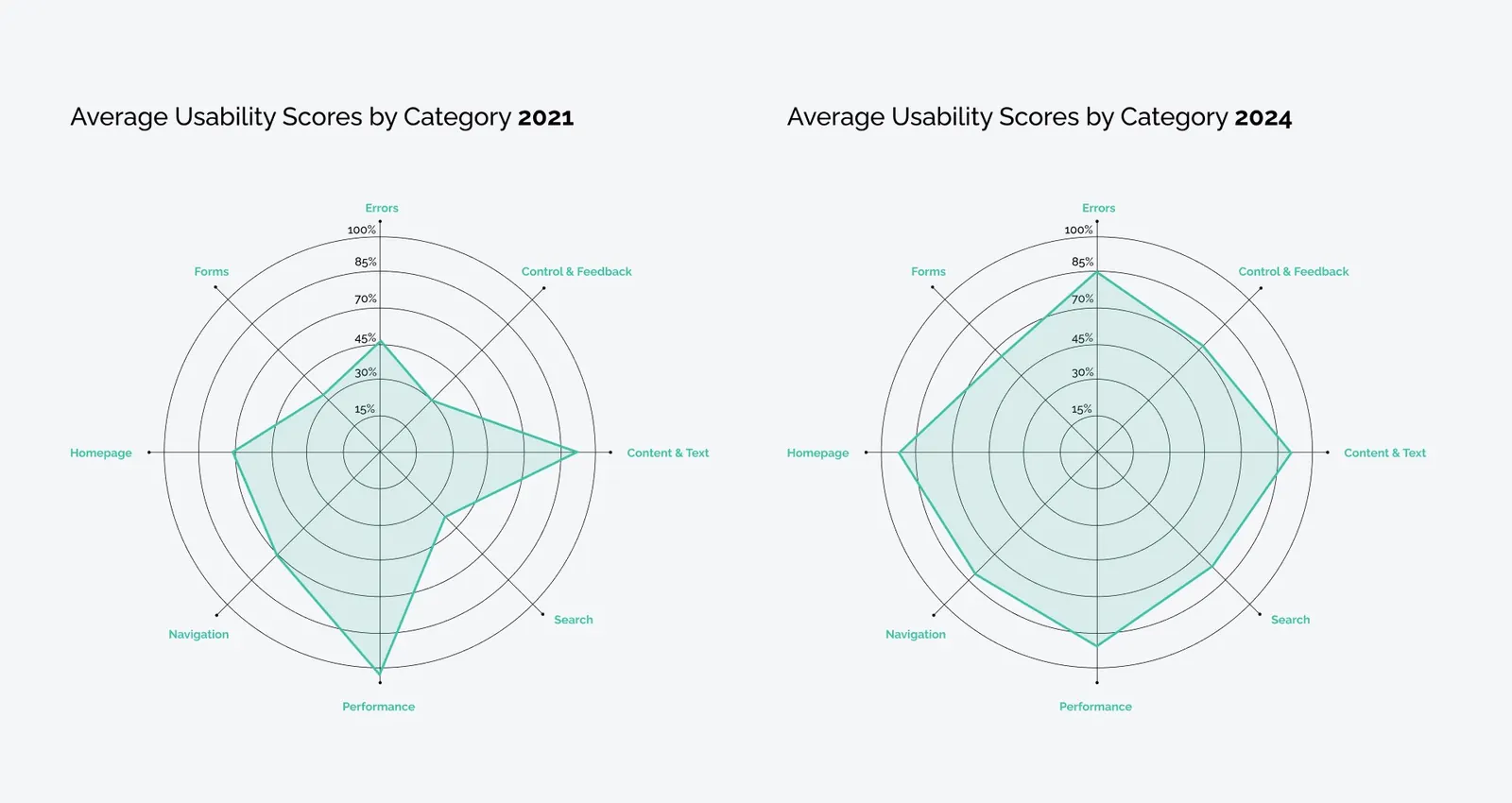
Measure first: usability scores by category, 2021 vs 2024.
The product was audited in 2021 and again in 2024, scoring errors, control and feedback, content and text, search, performance, navigation, homepage and forms.
Findings
- Register: form placement issues, email confirmation problems.
- Store setup: confusing icons and unclear steps.
- Extension installation: technical language too complex.
- Dashboard: inconsistent labels, unclear navigation, and visual hierarchy issues.
- Customization: problems with navigating between email customization and other settings.
Recommendations
- Improve form accessibility and clarity.
- Simplify technical language and enhance instructional clarity.
- Align buttons and enhance user guidance on the dashboard.
- Add labels to icons and improve overall UI/UX consistency.
Expected outcomes
- Increased user engagement and satisfaction.
- Higher conversion rates through improved onboarding and user experience.
- Reduced user frustration leading to better retention.
04 Update existing UI/UX
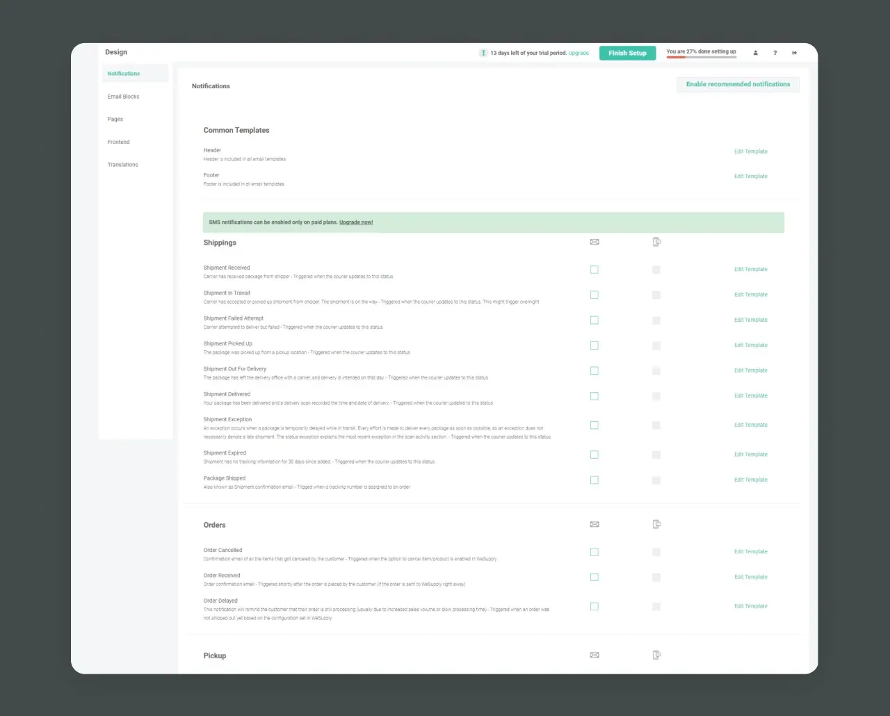
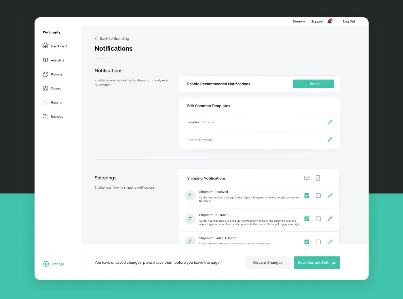
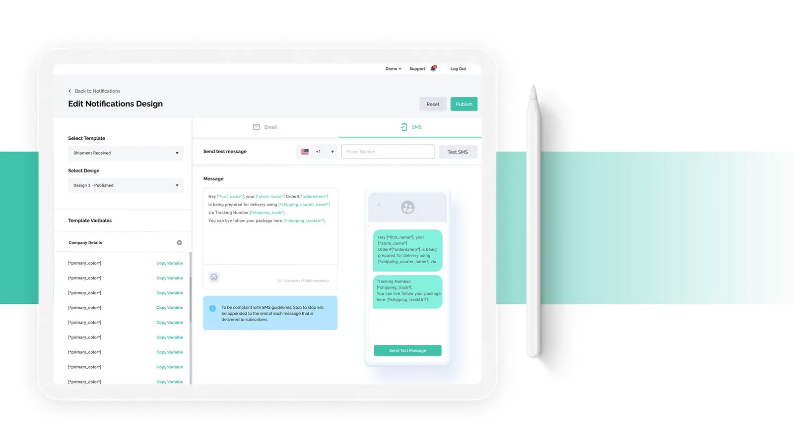
The notifications screen, before and after.
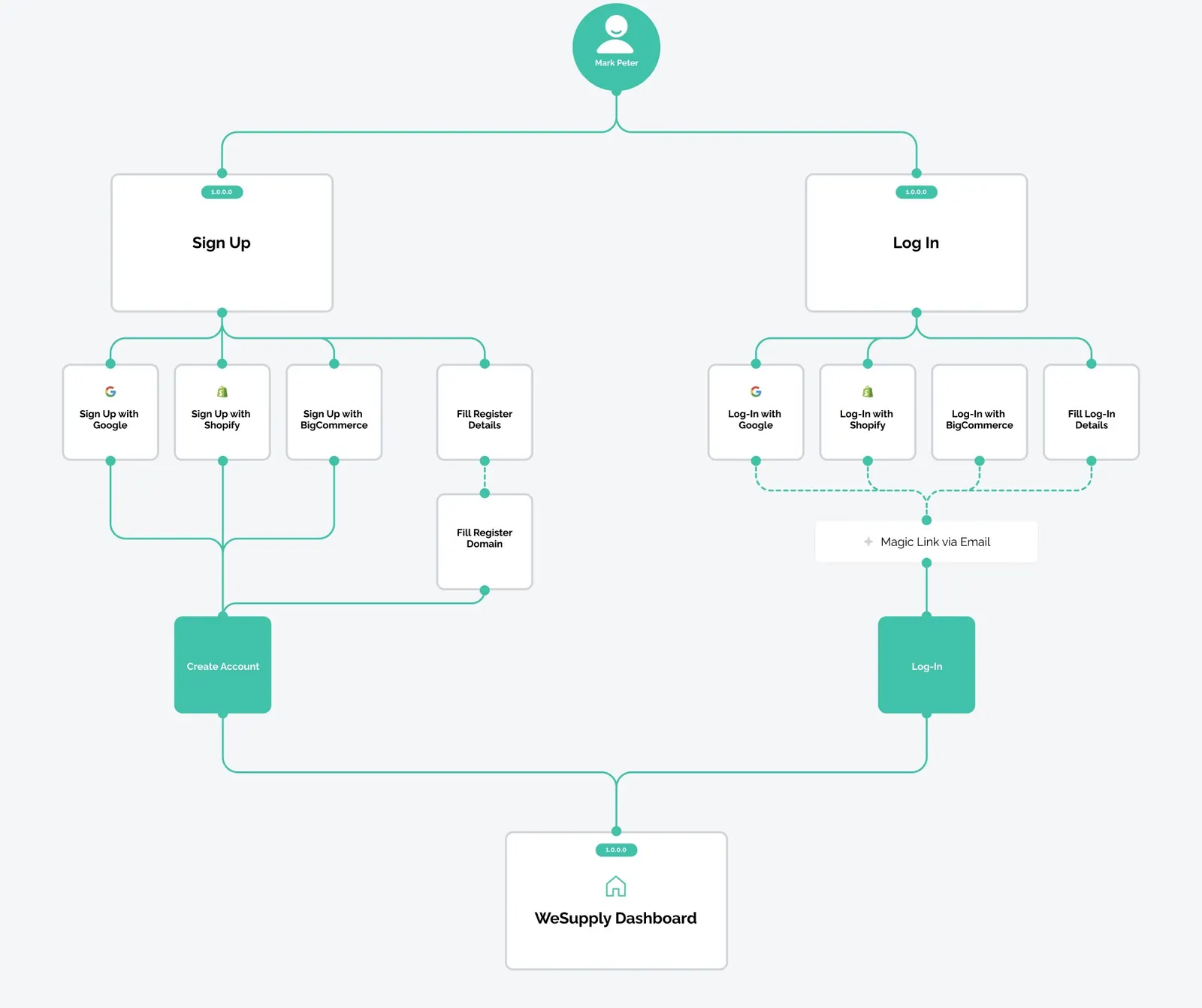
05 Onboarding redesign
Fewer steps to get in.
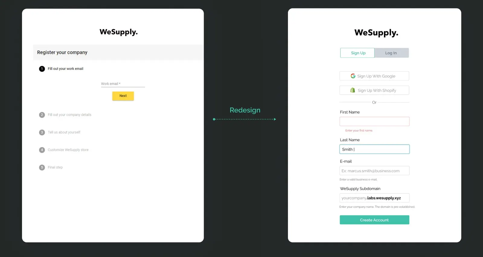
Analysis of login challenges. I found flaws in the log in and onboarding experience. There were too many steps. The process wasn’t automated.
I have combined different UX patterns to ensure that the flow is accessible and easy to use.
- Switch between login and sign up
- Display form errors and selection
- Email code confirmation process
06 Design system
Layout design, creating, organizing and documenting the design system.
- 01Competition analysis
- 02Iterations on layout
- 03Consideration of usability & navigation
- 04Establishing design system components
- 05Documenting the design system
- 06Adoption and governance
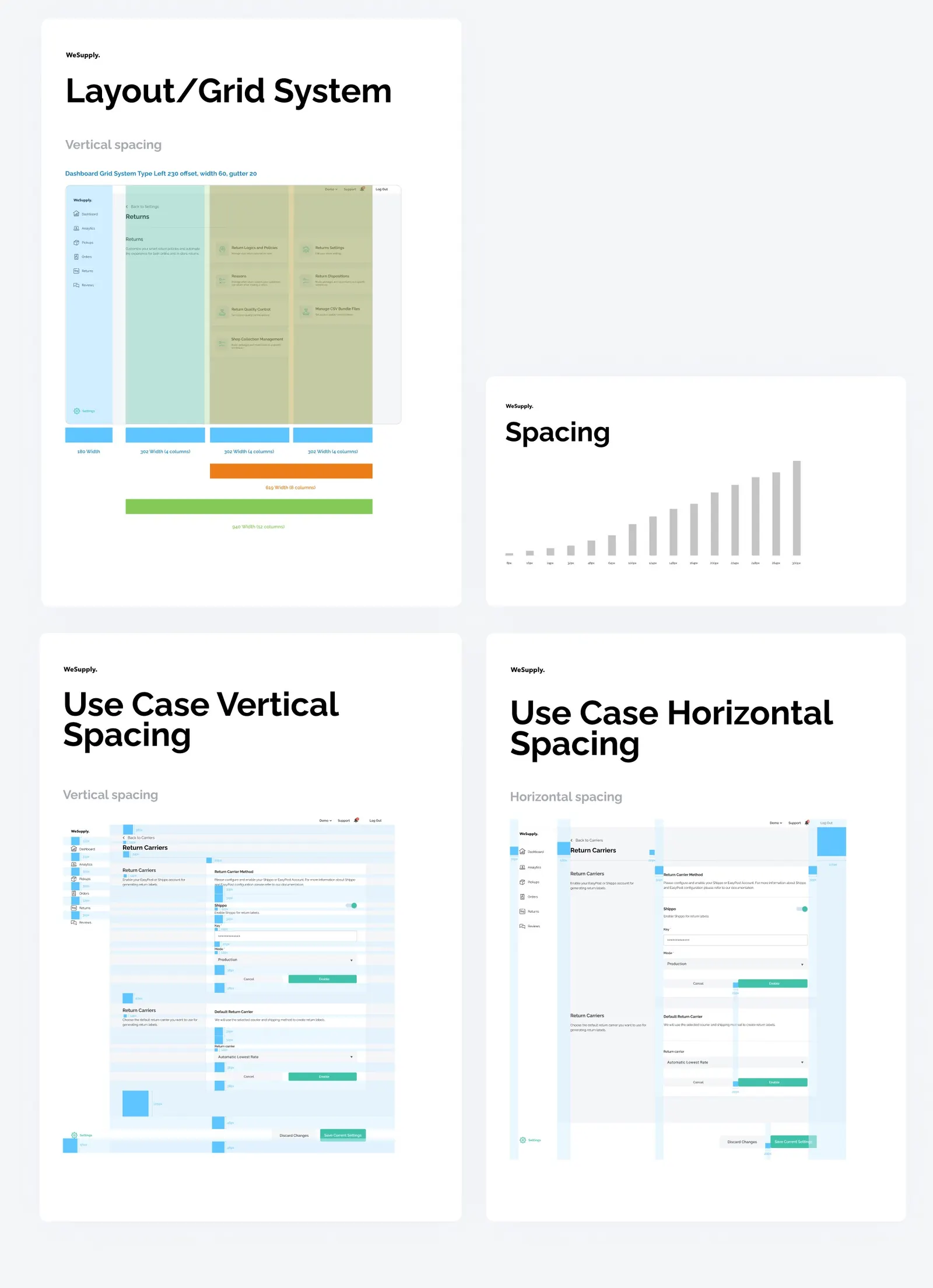
Layout iterations
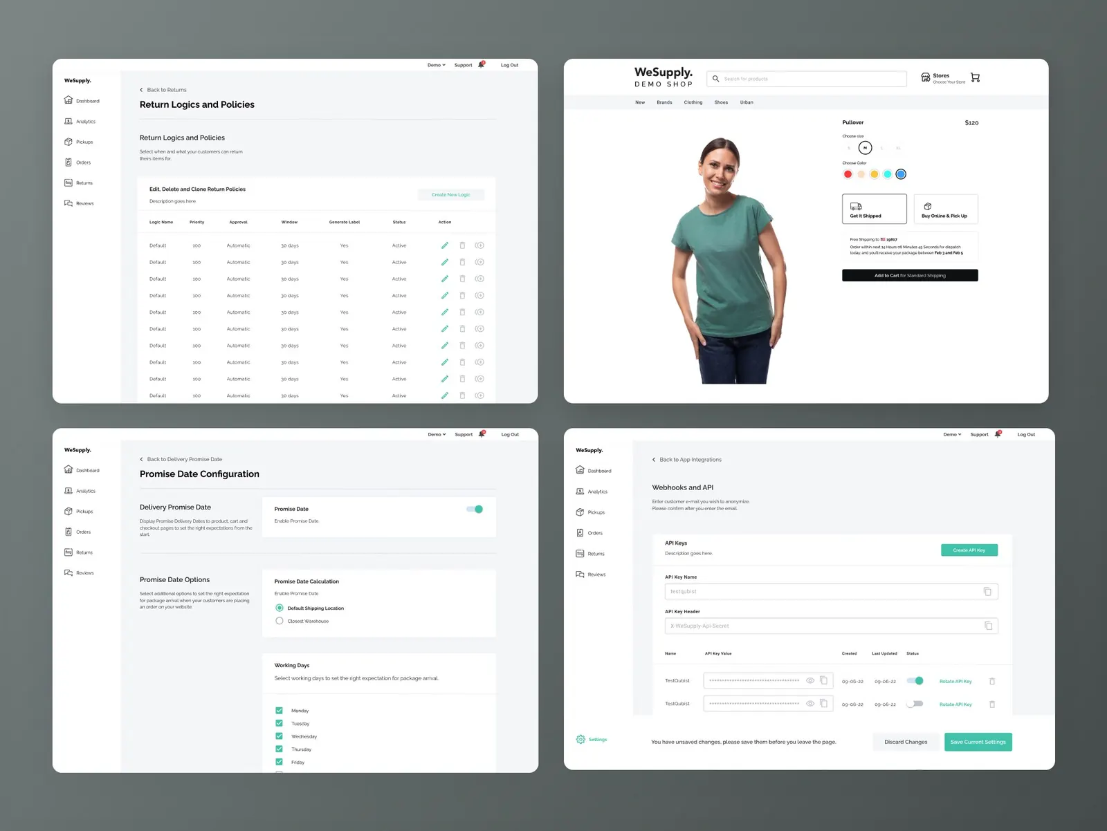
The layout design was an important milestone for the development of the product. From this starting point I have followed the guideline and created the entire screens.
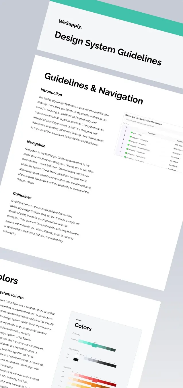
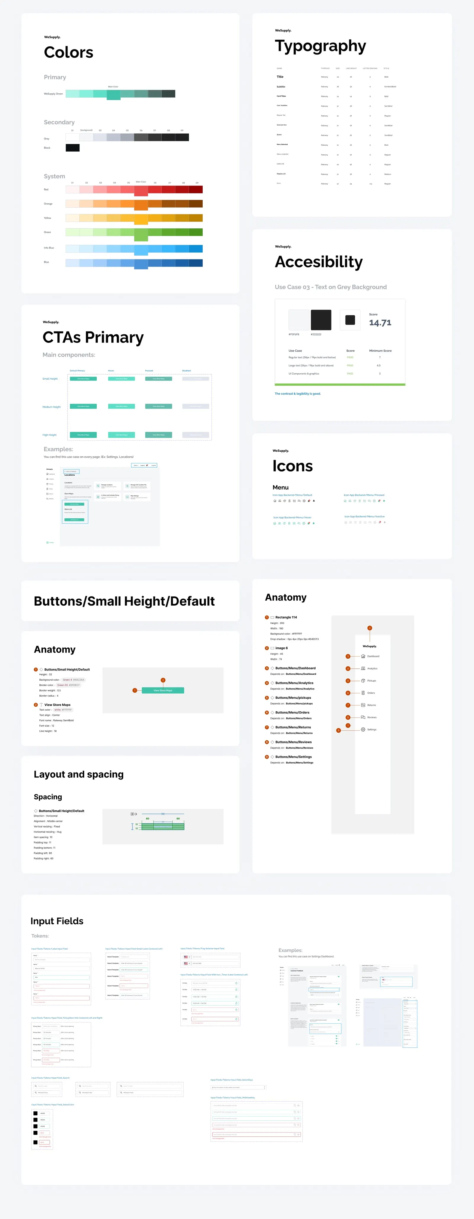
Design system components and guides
The design system components and guides provide a comprehensive framework for creating consistent, intuitive, and visually appealing user interface, ensuring a cohesive brand experience.
07 Design
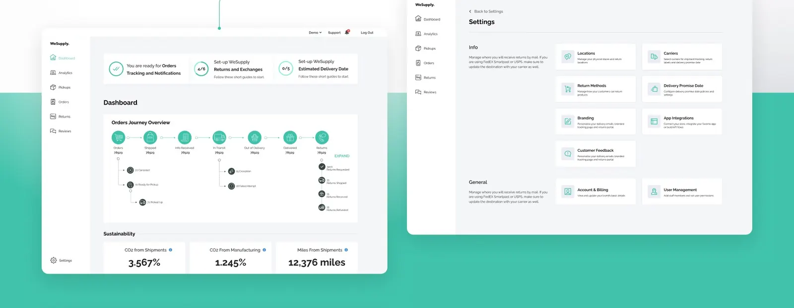
Onboarding, dashboard and settings screens.
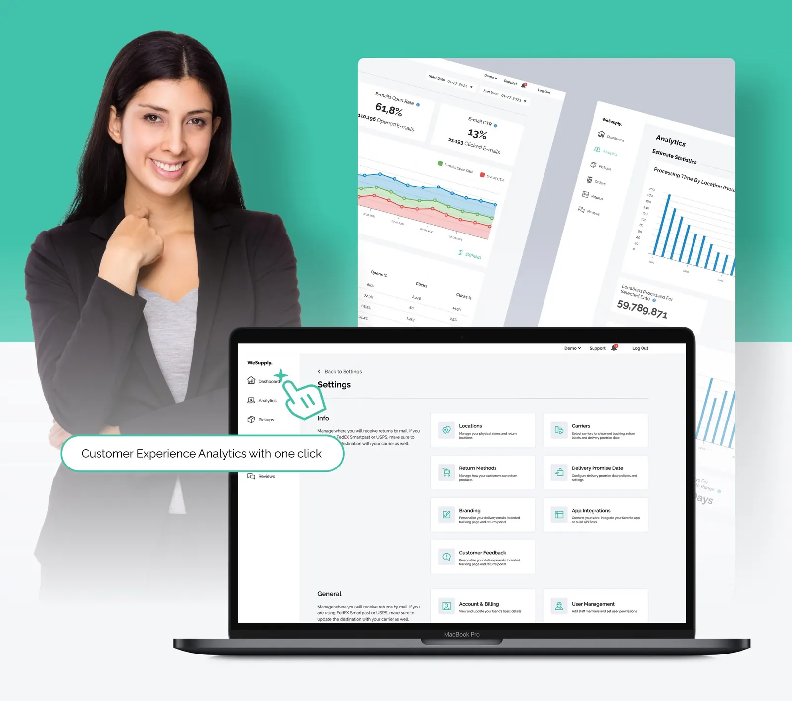
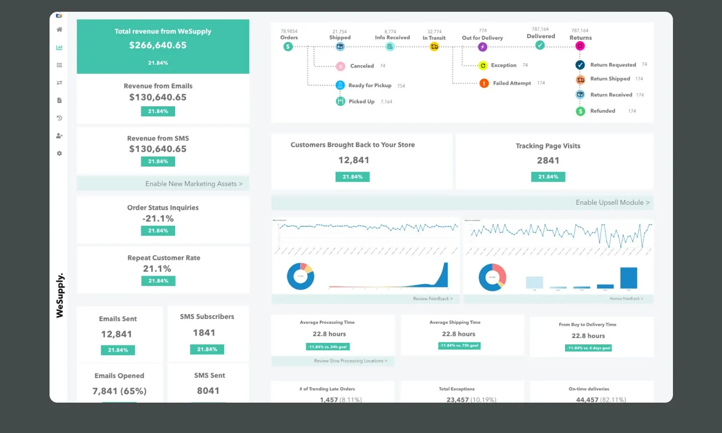
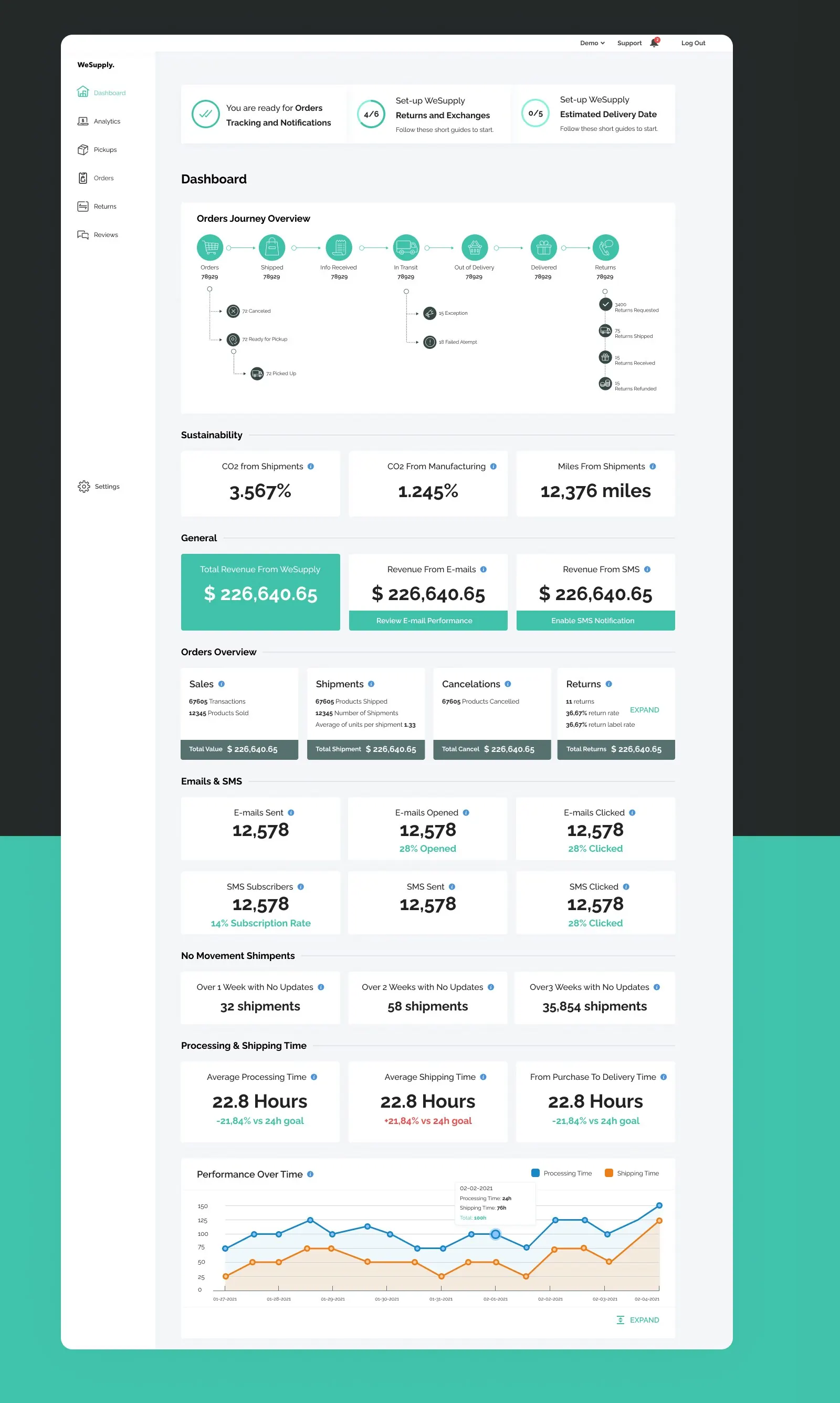
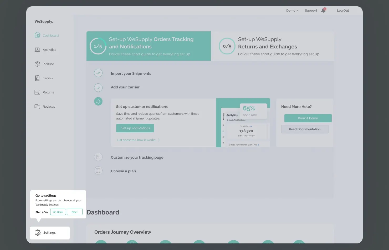
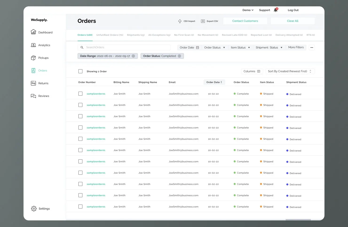
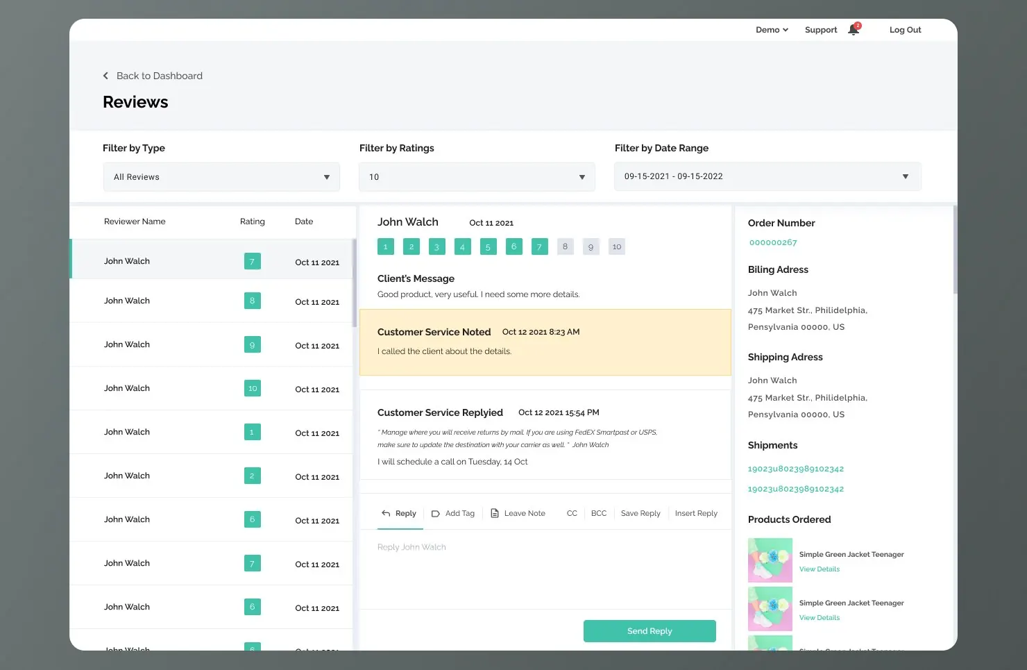
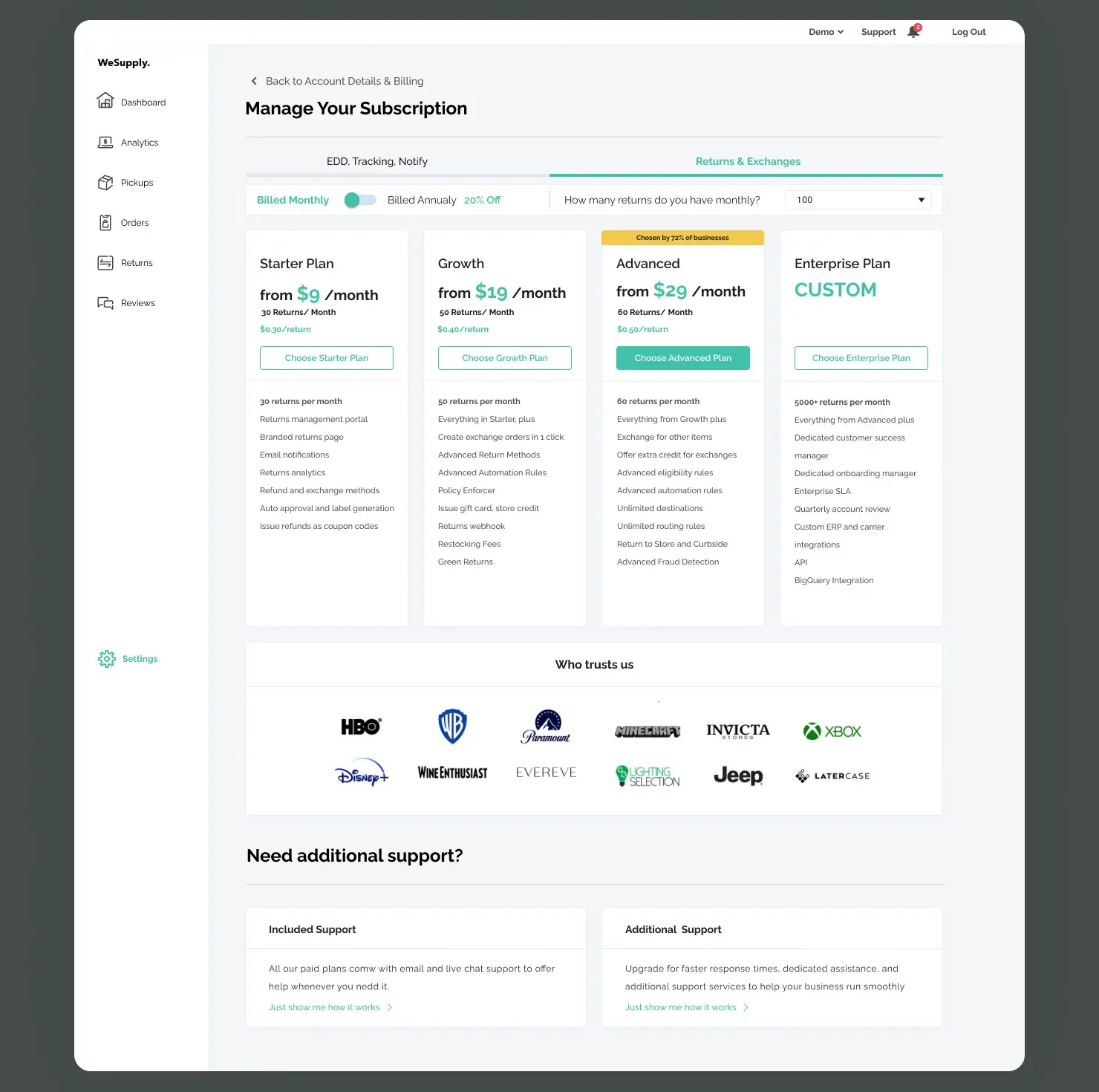
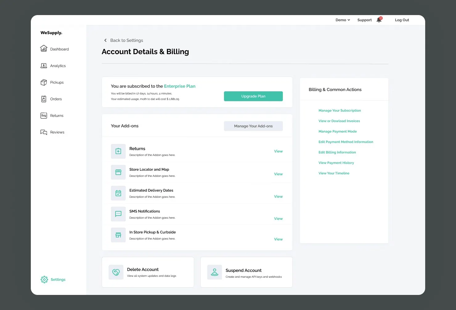
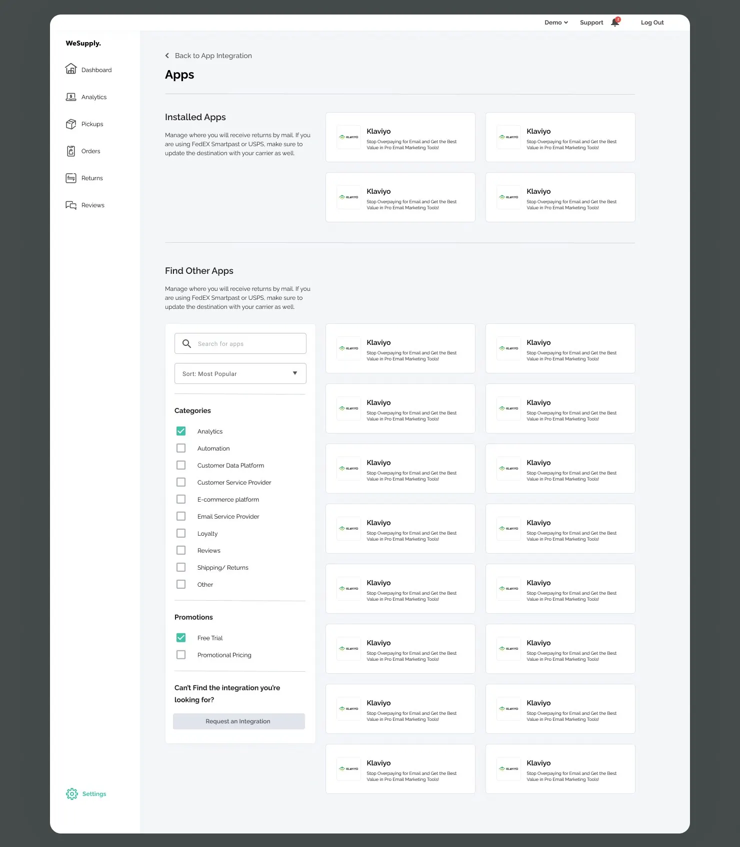
Based on the layout we designed, we created the Onboarding, Dashboard & Settings screens.
Main challenges
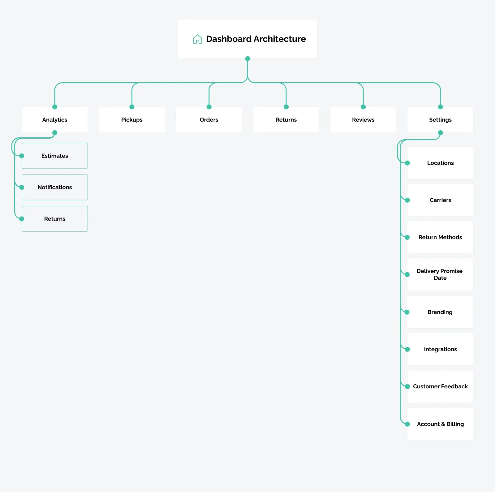
- Creating an easy-to-understand Information Architecture
- Developing a navigation system
- Organizing forms and actions for a seamless user flow
- Understanding the software and user needs for informed decision-making
Solution
- Collected and organized data into categories and sub-categories
- Implemented navigation breadcrumbs and clear, descriptive titles for each page
- Split the layout into two columns: information on the left, actions on the right
- Conducted meetings to align on each setting’s functionality and the overall product perspective
08 Extending the product · 2024
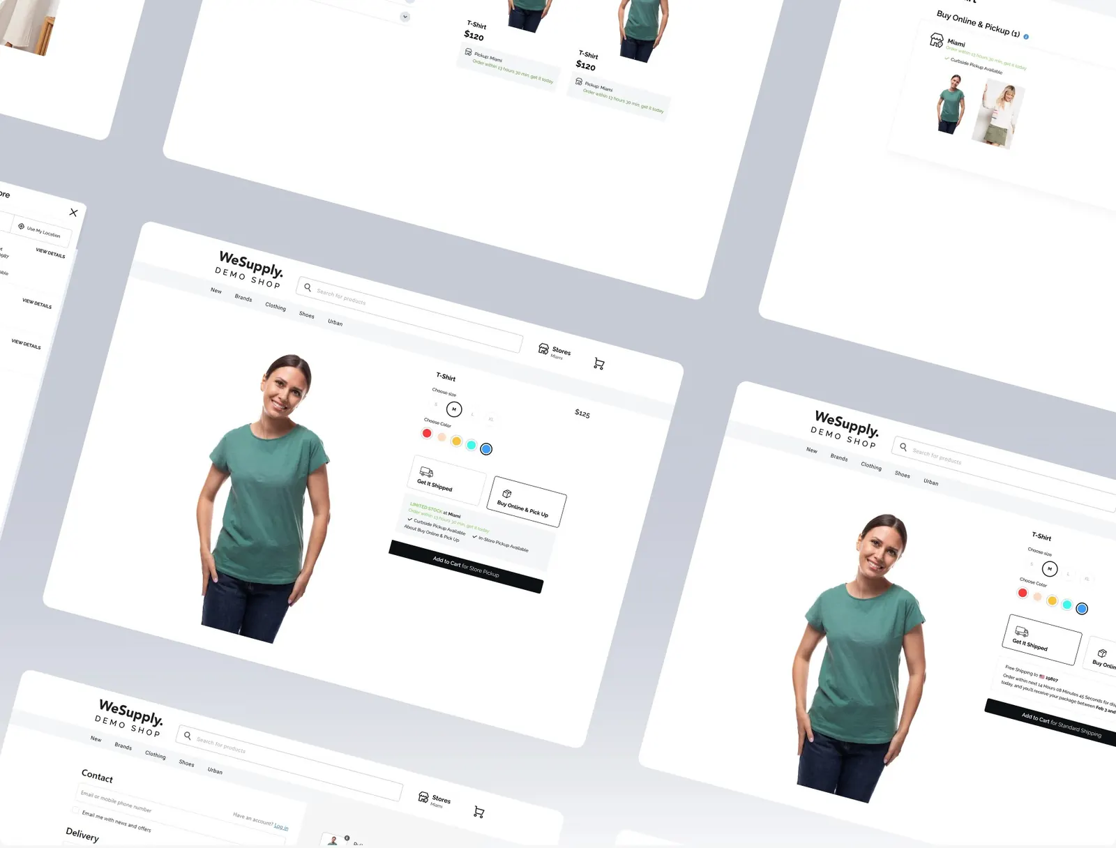
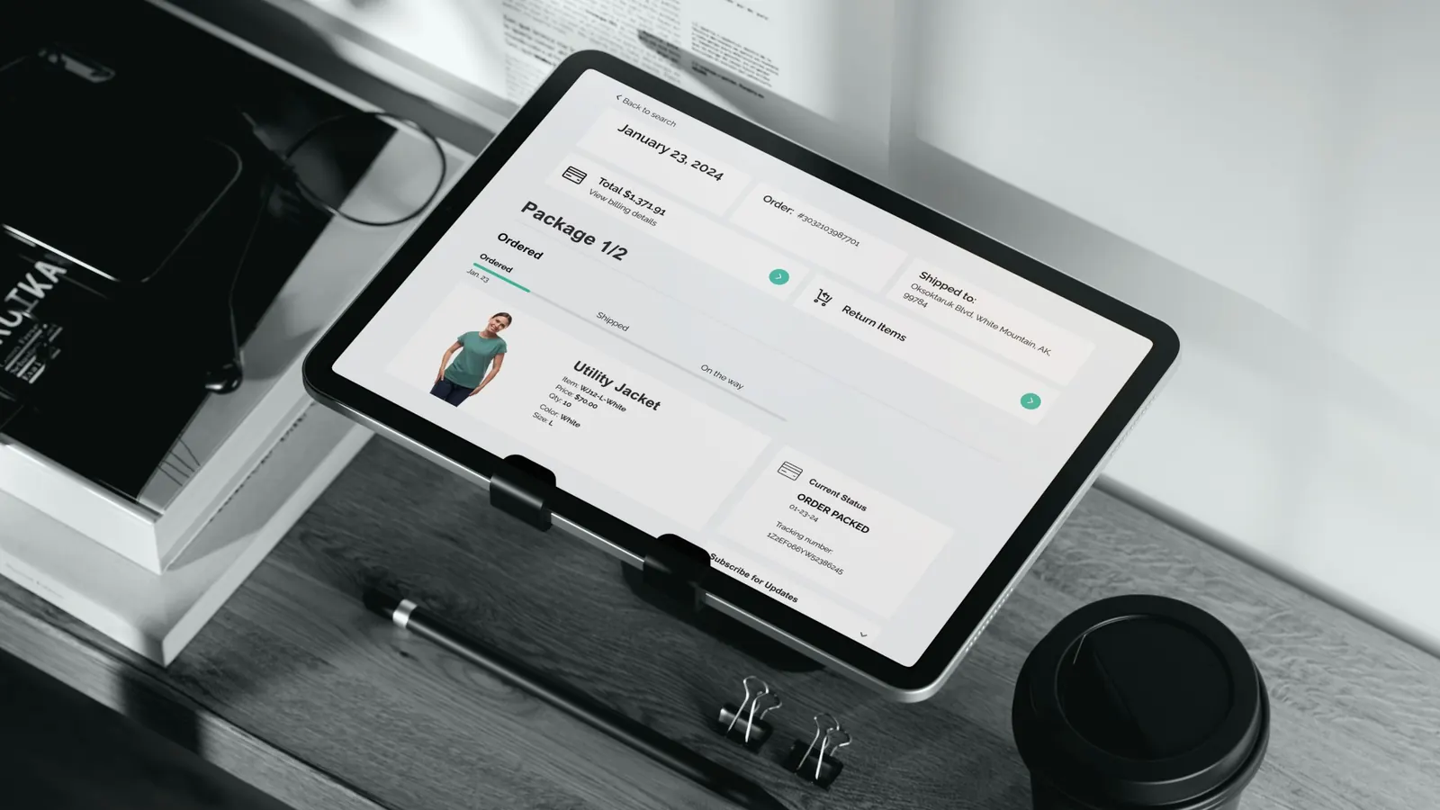
POS app & demo shop.
Prototype & design objectives
- Efficiency: an easy-to-learn flow using existing patterns from the web SaaS
- Deliver the prototype in 2 weeks
- Find the tools to reduce the time for designing the interface
- Stakeholders feedback
Prototyping tools and technologies
The first step was creating and refining the existing Return & Order flows. For designing and prototyping the flows of this app we used Figma.
For time efficiency we used an HTML to Design plugin to have a structure, and after this step we used pre-created components from the design system to assemble the interface.
Design validation and stakeholder review
In two weeks we had 3 meetings on reviewing the flows and adjusting the UI where it was necessary.
Next project
Dreamtter — Mobile app — Redbee Software
Let’s work together
Let’s start your project.
Send a brief in five taps or contact me directly.